If you’ve been tracking the spread of the COVID-19 pandemic around the world, as we have, you’ve doubtless seen a lot of statistics. The raw numbers look shocking, and in many cases they are, but as always it’s crucially important to ask yourself what the numbers mean.
For instance, our own Tom Nardi put together a counter that displays the total number of COVID-19 cases in the US. It’s a cool project that puts together some web-scraping, a nice OLED screen, and a 3D-printed network display. When this is all over, it can be easily re-trained to show some other statistic of interest, and it’s a great introduction to a number of web APIs. However, it’s looking at the wrong number.
 Let me explain. Diseases spread exponentially: the more people who have it, the more people are spreading it. And exponential curves all look the same when you plot out their instantaneous values — the raw number of COVID-19 cases. Instead, what distinguishes one exponential from another is the growth parameter, and this is related to the number of new cases per day, or more correctly, to the day-to-day change in new cases.
If left unchecked, and especially in the early stages of spread, the number of new cases grows every day. But as control efforts, mainly social distancing, take effect, the rate at which the number of new cases can slow, or even go negative. That’s the plan, anyway.
As is very well explained by this video from 3 Blue, 1 Brown, if this were a naturally spreading epidemic, the point at which the new cases just starts to decline marks the halfway point in the course of the disease. Here, we’re hoping that particularly strict quarantining procedures will cut this run even shorter, but if you’re interested in how the disease is spreading, the point when daily new infections turns around is what you’re looking for.
Why not put the daily difference in new cases on your desktop, then? These numbers are noisy, and the difference jumps all around. To be serious, you would probably want to put a moving average on the new cases figure, and look at that difference. Or simply show the new cases instead and look for it to drop for a few days in a row.
 Still, this won’t be a perfect measure. For starters, COVID-19 seems to incubate for roughly a week without symptoms. This means that whatever numbers we have, they’re probably a week behind the actual situation. We won’t see the effects of social distancing for at least a week, and maybe more.
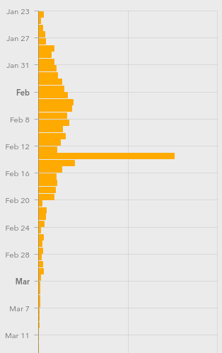
Further complicating things is the availability of tests, human factors like weekends when more people get tested but fewer government reporting offices are open, timezones, etc. (What happened on Feb. 13?)
I’m not going to go so far as to say that the COVID-19 stats that we see are useless — actually far from it. But if you’re going to armchair quarterback this pandemic, do it right. Plot out the daily new cases, maybe apply a little smoothing, at least in your head, and realize that whatever you’re seeing now probably represents what happened last week.
When you finally see the turning point, you may celebrate a little, because that means the halfway point was a week ago. We’ve seen it happen in China around Feb 2, and I’m looking forward to it happening here. I hope it happens wherever you are, and soon.
We will get through this. Stay safe, all. And keep yourself uninfected to keep others uninfected.
COVID-19 Statistics: Reading the Tea Leaves
Source: HackADay